


ROLE
Product Designer
TEAM
1 Product Manager
1 Tech Lead
TIMELINE
5 Months
SURFACE
WebApp
Item Bank
How an exclusive Single Customer Repository System was transformed into a content and access hub for the Universities across EU region.
8 MINUTE READ
My contributions
Alignment workshop
Discovery Interviews
Design Scoping
Information Architecture
Workflow Redesign
Clickable Prototype
Stakeholder Pitch
30s → 7s
A 4x reduction in task retrieval time for daily users
2x
Reduction in clicks to create a new question
A11Y
Fully compliant to WCAG 2.0 accessibility guidelines
At a glance
The product
A basic repository system where exam questions live, get reused, and get assembled into papers. Giving a user access to an item bank meant full control Read/Write/Edit/Delete of all items inside.
The problem
The basic nature of the Item Bank couldn't work for a General Availability (GA) product. Customers desired access control, better item management system, advance search indexing and more for GA launch
The catch
Most of the users open this product two or three times a year, not daily. Hence the interface has to be intuitive enough that one can use the webapp effortlessly after months of gap, and existing one was none of these.
What I proposed
A new author landing surface as the home of Item Bank, so content management and access management could sit side by side and scale further as new features gets built and integrated as services to Item Bank.
The result
Overall improvement in IA, with file retrieval of a recently used question dropping from 30+ seconds to under 7. The new IA now has room for the roadmap features that had nowhere to live earlier.
The new surface opens doors for new features to be added. Though my work mostly revolved around the "Crawl" and some of "Walk" phase, the platform enabled scalability.

All new Library
Your Library now houses everything, your multiple Item Banks to Questions, giving unparalleled visibility to your belongings.
Recents
A no brainer easy to understand file system that enables you to find your latest projects within seconds,
Contents
All your content at one place, categorized.
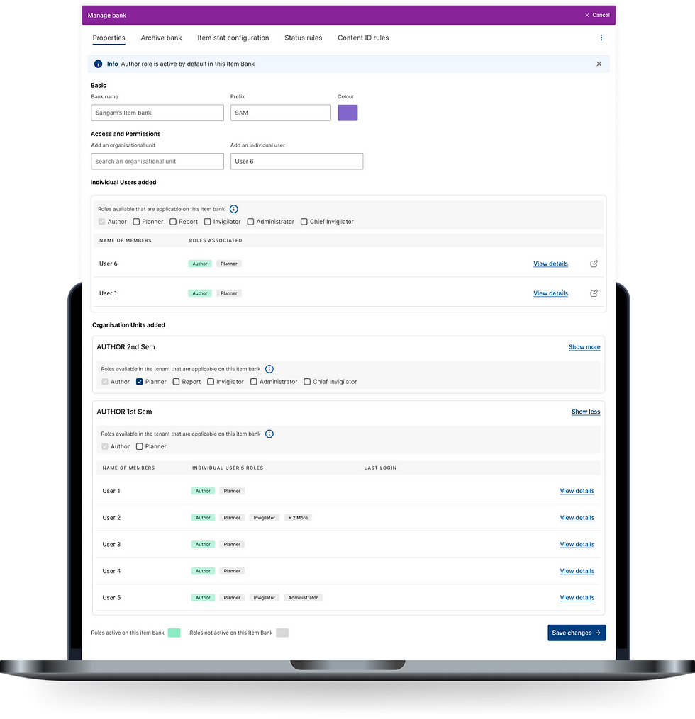
New Access Management
A new hub for all access management operations for enabling Item Bank owners granular control over their content.
Add Individual Authors
Add individual Authors with permission control, helping Visiting Faculties with clarity and you with finer controls.
Org Units, with a "s"
Now addition of multiple Org Units have become possible, with granular control of individual members.
08
What's new
07
Proposal
Design for Crawl Phase was the first Design Brief I had. It consisted of Lower Spec Sophistication for HE, with upto 5 Item Bank per user. The surface would remain the same, features would be added on top of existing UX.
For Access Management, was limited to Multiple Item Bank only, with Org Units, no individual User addition.
For Content Management we had the standard addition/creation of Question Sets, Questions in an Item Bank.
It explicitly excluded role granularity, multiple org units on one item bank, direct user access at bank level, and locking a role to a bank. All of that was Walk and Run Phase.
It was a good v1. It solved the immediate bleeding. Ship it, and universities could at least stop worrying that a visiting lecturer would delete a semester's work.
But while I was mapping things alongside PM, I realised that the existing surface works for what we are building this quarter. It does not work for what we are building next year. And next year had already started. For integration of the features of Walk and Run, would require a new surface.
"I kept running into the same feeling, if a new surface is not introduced now, the work load for Walk and Run would be too big for a new surface to be introduced then as an objective."
06
Initial Brief
Scenarios of Control (Role - Creator/Reviewer)

"This is what reality looks like. It's what they can do with other products and most importantly, it's what they consider to be 'Item banks'."
That sentence reframed the work. We were not adding a nice-to-have. We were meeting the definition of the category. A product that cannot express Scenario 3 is not an item bank as far as a university is concerned, irrespective of what we call it.
We had some cruicial insights on their ways of functioning with our existing tools, Authoring and the limited input from Original Item Bank users from CEQ.
Sensitivity
Universities treat questions and question sets with high security. Therefore access was limited to ensure accountability.
Visiting faculties
A visiting lecturer might be brought in to write questions for one module, for one semester, or to grade one exam session.
Roles overlap & rotate
The same person is an author here, a grader there, and should be nowhere near a third thing.
A model with one setting cannot express that.
Unbanked
Questions or Question Sets that were not a part of an assessment were called unbanked. It was the drawing board for the faculties, or untested items.
We understood the workings of our customers and how they did the Access Management side of things.
Key pain points from existing Content Management 1. The current system lacked the visibility of where a question is used and/or has been used, both in question sets and tests. 2. You cannot see which question set a question sits in, or which test a question set is used in. 3. Forgetting to duplicate a question instead of using the original. Users do not understand the difference between duplicating a question and editing the live one, so they edit the original by accident. 4. Locked questions because someone else has opened them. Provided Access was notified via sending an email. 5. Not being able to lock or finish a question, so it can't be edited." There was no way to say this is done. 6. Filtering could not do AND, OR or NOT. No way to choose between inclusive and exclusive filtering across multiple tags. 7. You cannot merge two question sets, so collaboration inside one set has no workaround. 8. Version control was absent. "Which version is used in which question set or test?" My favourite finding, because of what it reveals: authors had stopped using tags entirely and were encoding metadata into question titles as abbreviations. "MR" in the title meant multiple response. When the organising system fails, people build a worse one inside the only field they control. That is not user error, that is a product telling you exactly what it is missing.
01
The Plot
04
Cracking the code
03
How we got there
05
Final Roadmap
Product and design had an alignment session with one agenda : align on an understanding on how universities function internally, what problems we are tackling, our assumptions, our vision and success criteria, what we are not sure about, and how we would go and find out. That last one is what made the workshop useful.
Some of the looming questions that we settled on 1. What are the considerations for HE (Higher Education, a collective term for Institutions who'd use our enhanced Item Bank) authors to reuse Content Block? 2. How is the faculty operations structured? 3. How do you see permission being managed among content contributors? 4. How are roles mapped to departments and courses? Does HE operate with monolithic or multi-operator roles? 5. If you were given a number of custom metadata fields, what would you use them for? 6. How much control would you need over authors? Could you trust them to manage themselves within an item bank, where everyone has full permissions?
Before this, it was important to prime their thought process of how we thought of Item Bank with a simple presentation which explains how we see item banking, org structure, permissioning, metadata, it will establish a structure for them to map, to kickstart the thought process.
We then followed up with online workshops. Faculty and central assessment staff from across Norwegian and Swedish higher education, through SIKT, and later sessions and trackers that pulled in Uppsala and the institutions under SUNET.

Snippets from the workshop figjam


The revamp of Item Bank was born out a decision to turn it into a General Availability (GA) product. Inspera's customers i.e. University of Oslo (UiO), SIKT (Norwegian Agency for Shared Services in Education and Research) wanted Inspera to have a repository system, and Inspera had a Repository System, but it was not exactly what UiO and SIKT were looking for, well not yet.
What was Inspera's Item Bank?

PRODUCT CONTEXT
Inspera's Item Bank was developed exclusively for the use of their biggest customer, Cambridge (U.K.) for the sole use case of IELTS, therefore the whole experience was shaped around CEQ (Cambridge English Qualifications) authors. It served as 2 tier management system
Visualizer explainer Item Bank's Content Management had three major components to its functioning. These three items were stored in a user's bank, hence the name Item Bank. They were: 1. Question Sets: A collection of Content Blocks. 2. Content Block: A collection of Questions that Authors could swap and reuse. 3. Questions: The Questions that Authors (mostly faculties) designed. This was used by a very particular kind of user: a centralized, trained, professional item writing team, working with standardized processes, inside one organization, at high volume. Because of this very nature, Item Bank's Access Management system was rudimentary. It had two components to its functioning. 1. Individual Users/Authors 2. Org Units (A group of Authors created on a need-to-need basis) What I meant by rudimentary is, for example when an author gave access to an item bank to a user or an org unit, that user got read, write and delete on everything inside it. There was no middle setting. No "can create, cannot delete." No "can see their own questions, not everyone's."
The Users of this Product Inspera Assessment for every other university serves six user archetypes, and Item Bank touches most of them: 1. Author writes the questions. Wants clear questions that map to learning objectives, and wants to know how they performed last time. 2. Planner sets up the assessment. Acts as the switchboard between departments, and is usually the person everyone messages when something breaks. 3. Grader marks the submissions. Often external, often occasional, and often has to relearn the tool each time. 4. Marker and Proctor/Invigilator sit around the delivery event itself. 5. Candidate takes the exam. 6. Admin manages users and org units, and carries the compliance weight, GDPR included. The wrinkle is that these are roles and not just people. One professor can be an author, a planner and a grader in the same semester, for different courses. A department head might be a grader on one paper and have no business seeing another paper at all. Access, therefore, was never going to be a simple ladder. In the CE Itembank, access is granted either to an individual, or to an org unit, which is a group like "Semester 3 and 4 Physics faculty." Hold on to org units. They come back later, and not in a good way. Therefore the existing CE model would collapse and not work for GE.
With a strong emphasis: Most of the products we design for assume habit. We open Figma daily, or Jira, or Slack/Teams constantly. Muscle memory does a lot of the work of the interface, and the learning curve is a one-time tax you pay in week one followed by constant refresh of memory due to usage.
Assessment software does not work like that. An author opens Item Bank when an exam cycle demands it. That might be twice a year. A visiting grader might open it once, in November, and never again.
Older faculty members, the ones with thirty years of teaching behind them, were routinely asking a younger, more technically comfortable colleague to sit with them and walk them through it. Not once. Every cycle. A senior academic who is an authority in their subject was being made to feel like a beginner by a piece of software, in front of a junior colleague, twice a year.

The plan PM and I started from was sensible and contained. Keep the Item Bank split into two halves:
Access Management : Add/Remove org units with Add/Remove individuals.
Content Management : Create/Add questions, question sets and content blocks, and pull in questions from unbanked content.


02
New features being asked to fit through a dropdown.
The new library flow was inevitable with the grand scheme of features planned. If we don't design scalable design in Crawl Phase, GA item bank customers will have to relearn a new interface in the Walk/Run phase later. Changing interface mid-adoption of a product is bad impression, especially amongst the senior faculties.
03
The category grew up around a different user.
Item banking comes from awarding bodies: professional writing teams & psychometricians who live in the tool daily. Higher education is broad and shallow where awarding bodies are narrow and deep. Building the awarding-body shape and handing it to a university was the obvious mistake, and the one the category had already made.
04
Walk and run had no floor to stand on.
The crawl, walk, run framing was right and the sequencing sound, but the later stages needed somewhere to be integrated and the existing surface could not hold them. Build crawl on the old IA and we rebuild twelve months later, with customers already trained on the wrong older model.
01
Item Bank had quietly stopped being a repository.
Every item on that roadmap is content management or access management. A repository stores things. This was becoming the place where content is created, judged, organised, governed and released. That is a hub, and hubs need a front door.
Engineering commitments were decided for features in the Crawl Phase. Therefore prom that perspective, my proposal wouldn't change the effort there. However my proposal would reimagine the landing page, redesign the UX to improve scalability, visibility so that in future we wouldn't be stuck with adding features on top of one another, increasing learning curve while compromising the visibility of features.
Here we compare the effort and UX to create a New Question Set between old workflow and new workflow.
I proposed a new surface: an author landing page as the home of Item Bank. Not a redesign of the existing "dashboard" itself. A new front door. The place an author lands when they log in, showing their item banks, their recent work, stat highlights (in future), and a create menu that reaches every content type directly.
I took it to my Product Manager Nikhil first. Expressed the project, caveats and details. He backed it, and then I presented it to stakeholders, i.e. Head of Product, Head of Design, Tech Lead.
The argument I made was not "the current design not cutting it" but rather "here is where we will be in four releases, and here is the surface that gets us there without a rebuild later." I walked them through the roadmap they had written, feature by feature, and showed each one landing on the new IA. Then I showed the same exercise on the existing IA, where by feature three you are nesting menus inside menus.
The proposal received positive feedback and was approved.
A key difference was introduced. In The older CE Item Bank, you could only create a "visible" content inside an Item Bank. The New version introduced a concept of a drawing board, we called it Unbanked, where you can create content without requiring an Item Bank for visibility.
This was done so anyone could design a question unofficially, especially visiting faculties. Once the item is approved to be used in a test, it can then proceed to sit inside an Item Bank.
My arguments to support the new redesign during the crawl phase were
02
The Caveat
Old
30+ Seconds to create a new Question Set.
Difficult IA of userflow slowing elderly Authors who use the webapp 4 times annually.
Poor discoverability of content.
No way to know the Question Type from the surface/overview.
Org Units get unrestricted access to your Item Bank.
No scope for adding individual Authors to Item Bank.
Only Author roles allowed to participate in an Item Bank.
Lack of scalability for future products and services.
New
~7 Seconds to create a new Question Set.
Intuitive IA that ensures ease of use and visibility to elderly Authors.
Surfaced content, enabling faster content retrieval.
Labels depicting the Question Type, making visibility easier for Authors.
Granular control access of Org Units, of what they can/cannot do in your Item Bank.
Multiple individual Authors and Org Units can be added to your Item Bank.
Planners, Graders, invigilator support added to Item Bank enhancing collaboration.
Enabling scalability for "walk" and "run" phase, and more.
What would I do differently
I would have pushed on access management for org units earlier and harder. Org units were being used singularly with full access of edit rights. A completely different hierarchy at once. I flagged it but chose to not escalate it as the Author Library was a new development. I would've liked to treat "this foundational concept is overloaded" as a blocking finding.
I would have run the workload study before the pitch, not after. The 30-to-7-second number carried the room, but it was the easy number. The cognitive load data was the stronger argument for the permissions work specifically, and it arrived after the decision was already made.
Closing
The brief was permissions. What the work turned into was an argument about where a product was heading and whether its current shape could get there.
The thing I keep coming back to is the elderly professor asking a younger colleague for help, twice a year, every year. The author typing "MR" into a question title because the tagging system had failed them. Neither of those is a niche edge case. In a product used sporadically by hundreds of thousands of academics, those are the median experience. Designing for the person who forgot everything is not a constraint on the work. It turned out to be the clearest guide to what the work should be.
